Pulse Design System

A modular, design system built from scratch to power M3DICINE’s Stethee ecosystem – unifying native iOS, Android, and Web interfaces across clinical, veterinary, and research applications.

Client:

M3DICINE

Category:

Design System, HealthTech

My Role:

Senior UI/UX Designer

Unifying digital health experiences.

The Pulse Design System is an enterprise multi-library UI architecture engineered from scratch to connect M3DICINE’s AI-enabled Bluetooth medical devices (Stethee) with multi-platform software applications.

Pulse unifies real-time clinical acoustic data, complex audio spectrograms, and strict medical accessibility standards (WCAG 2.1 AA) into a single scalable source of truth.
Project Context & Ecosystem

Stethee is an AI-enabled stethoscope system that captures, amplifies, and streams live heart and lung acoustic data via Bluetooth across three target platforms:

Stethee Pro (iOS, Android, Web): Clinical, real-time auscultation interface for physicians and cardiologists.

Stethee Vet (Mobile): Rugged, quick-tap diagnostic app tailored for animal healthcare.

Stethee IO (Web SaaS): Internal research dashboard for AI engineers to analyze audio frequencies and train acoustic models.

Problem Statement & Challenges

Designing for AI-driven medical hardware requires balancing complex real-time bio-data with fast-paced clinical environments. Prior to Pulse, scaling features across three distinct software products created critical bottlenecks

Visual & Functional Fragmentation

Inconsistent UI patterns across platforms increased cognitive load for clinicians during consultations.

Visual & Functional Fragmentation

Inconsistent UI patterns across platforms increased cognitive load for clinicians during consultations.

Unstandardized Bio-Data

High-density audio visualizers (spectrograms, phonocardiograms, AI murmur indicators) lacked visual hierarchy and clarity.

Unstandardized Bio-Data

High-density audio visualizers (spectrograms, phonocardiograms, AI murmur indicators) lacked visual hierarchy and clarity.

Design & Engineering Debt

Teams repeatedly rebuilt core UI components, causing friction and delay during cross-platform developer handoff.

Design & Engineering Debt

Teams repeatedly rebuilt core UI components, causing friction and delay during cross-platform developer handoff.

Compliance & Accessibility Risks

Lack of standardized visual tokens threatened strict WCAG accessibility compliance and readability under varying hospital lighting conditions.

Compliance & Accessibility Risks

Lack of standardized visual tokens threatened strict WCAG accessibility compliance and readability under varying hospital lighting conditions.

UI/UX Research & Audit Findings

An end-to-end audit of existing codebases and clinical workflows revealed three primary operational priorities:

Stakeholder Alignment: Conducted cross-functional workshops with Product Owners, Business Analysts, and Engineers to map native platform constraints (Apple HIG vs. Google Material Design).

Component Discrepancy Audit: Uncovered 40+ button variations, 15 form styles, and inconsistent dark-mode contrast ratios across products.

Clinical Usability Insights: Identified critical needs for gloved touch-target sizing, high-contrast audio waveform displays, and real-time status feedback for Bluetooth connectivity and battery levels.

Figma File Structure & Page Taxonomy

To maintain file performance, modular governance, and clear team ownership, Pulse was architected into 5 specialized, interconnected Figma libraries.

Why this file structure works

Zero Cognitive Friction: Designers and developers switching between iOS, Android, or Web files encounter the exact same page naming and organization logic.

Accelerated Handoff: Engineers can jump directly to specific sub-categories (like Data Visualizations or Authentications) to inspect specs and token names instantly.

High Performance: Separating Foundations, iOS, Android, and Web into distinct files keeps Figma canvas load times fast and prevents memory lag during large-scale design iterations.

Core Foundations Layer

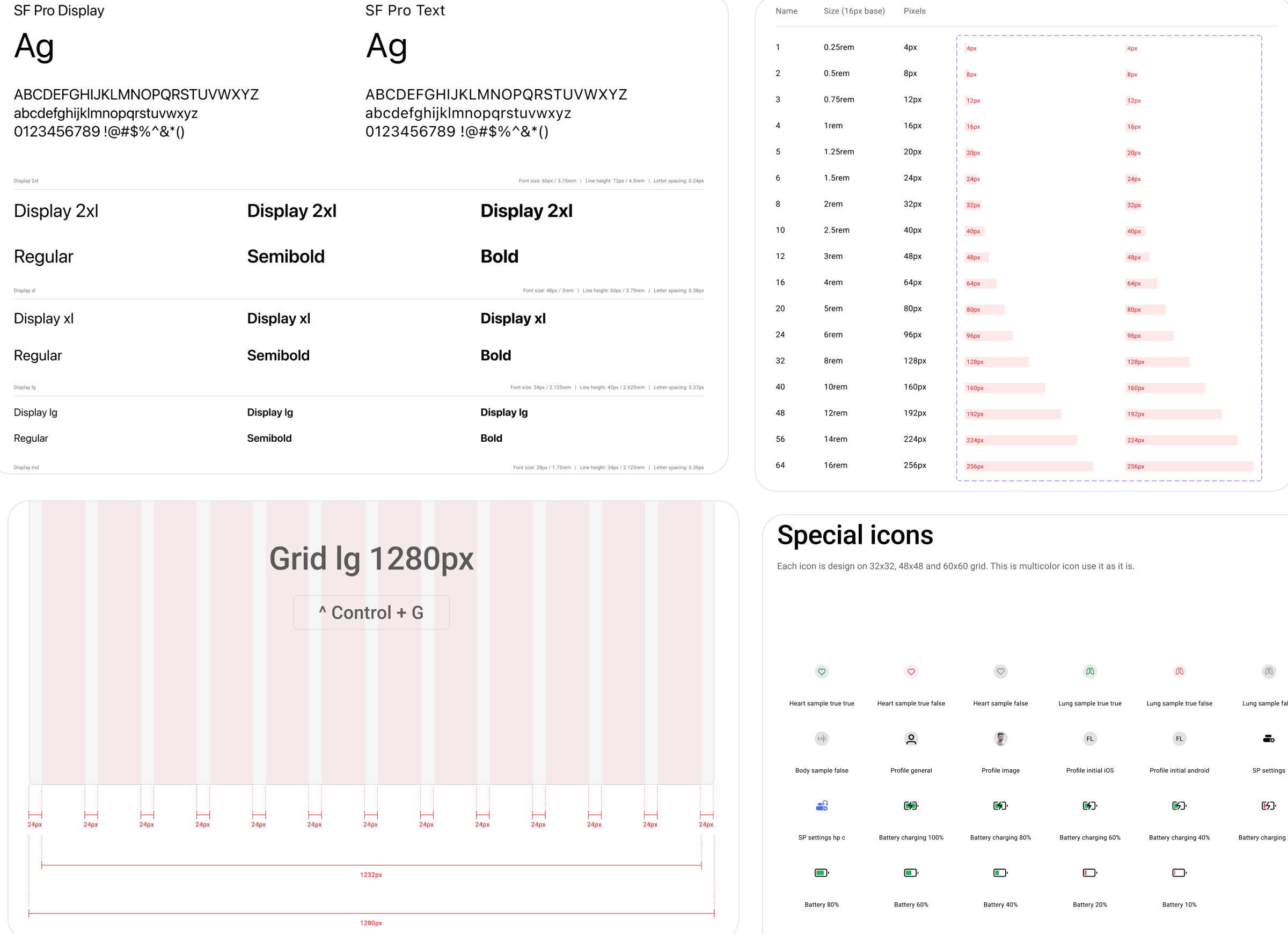
The Foundations Library acts as the single source of truth for global primitives and tokens, feeding visual rules into all platform-specific libraries: Colors • Typography • Effects • Grids & Spacing • Logos & Icons • Units • Design Annotations

Core Foundations Layer

The Foundations Library acts as the single source of truth for global primitives and tokens, feeding visual rules into all platform-specific libraries: Colors • Typography • Effects • Grids & Spacing • Logos & Icons • Units • Design Annotations

Core Foundations Layer

The Foundations Library acts as the single source of truth for global primitives and tokens, feeding visual rules into all platform-specific libraries: Colors • Typography • Effects • Grids & Spacing • Logos & Icons • Units • Design Annotations

Standardized Component Taxonomy

Across iOS, Android, and Web libraries, all UI elements are grouped into 7 functional component categories: Actions • Containers • Inputs • Feedbacks • Navigations • Status • Data Visualizations

Standardized Component Taxonomy

Across iOS, Android, and Web libraries, all UI elements are grouped into 7 functional component categories: Actions • Containers • Inputs • Feedbacks • Navigations • Status • Data Visualizations

Standardized Component Taxonomy

Across iOS, Android, and Web libraries, all UI elements are grouped into 7 functional component categories: Actions • Containers • Inputs • Feedbacks • Navigations • Status • Data Visualizations

UX Pattern Library

While components represent atomic UI controls, Patterns define reusable, multi-step user workflows tailored to platform guidelines (Apple HIG, Material Design, and Responsive SaaS): Authentications • Forms & Search • Headers, Bars & Keyboards • Notes & Patient Logs

UX Pattern Library

While components represent atomic UI controls, Patterns define reusable, multi-step user workflows tailored to platform guidelines (Apple HIG, Material Design, and Responsive SaaS): Authentications • Forms & Search • Headers, Bars & Keyboards • Notes & Patient Logs

UX Pattern Library

While components represent atomic UI controls, Patterns define reusable, multi-step user workflows tailored to platform guidelines (Apple HIG, Material Design, and Responsive SaaS): Authentications • Forms & Search • Headers, Bars & Keyboards • Notes & Patient Logs

System Governance & Version Control

To maintain alignment across ongoing product releases, every platform library includes built-in governance tools: Changelog • Design System Assets • Cover & Overview Pages

System Governance & Version Control

To maintain alignment across ongoing product releases, every platform library includes built-in governance tools: Changelog • Design System Assets • Cover & Overview Pages

Design Tokens & Accessibility

Token Hierarchy & Semantic Mapping

Primitive Tokens: Base values (e.g., #0A66C2).

Semantic Tokens: Role-based assignments (e.g., surface-clinical-primary, status-ai-active).

Component Tokens: Element-specific properties (e.g., button-primary-bg-hover).


WCAG 2.1 Compliance

Clinical Contrast Ratios: Strictly enforced 4.5:1+ contrast for text, audio controls, and status indicators across dark/light themes.

Tabular Numeral Typography: Configured fixed-width numbers for real-time BPM counters to eliminate layout jitter.

Touch Target Sizing: Minimum targets of 48x48dp (Android) and 44x44pt (iOS) for accurate operation with surgical gloves.

Governance & Developer Handoff

Design Token Sync: Mapped Figma variables to JSON for automated front-end code sync.

Design Annotations: Included WCAG specs, touch bounds, and state mappings on component pages.

Developer Alignment: Matched Figma properties directly with React, Swift, and Kotlin naming conventions.

Quantitative Impact & Results

Implementing the Pulse Design System delivered measurable operational and UX improvements across M3DICINE’s digital product line:

28% Increase in user task completion speed across clinical medical workflows.

35% Reduction in usability errors during live patient audio playback and recording.

40% Drop in post-launch support tickets regarding navigation and Bluetooth connectivity clarity.

96% First-Pass QA Success Rate during developer handoff across multi-functional Agile delivery teams.

Building a design system for AI-enabled medical devices taught me that design systems aren't just about visual consistency—they are risk-reduction frameworks that directly drive operational speed, regulatory compliance, and clinical safety.

Mubin ul haq Vhora

Product Designer

Interested in seeing more of my work? Explore how I approach different product challenges and design systems.

Create a free website with Framer, the website builder loved by startups, designers and agencies.